Creating a landing page that converts visitors into customers is both an art and a science. It involves understanding your audience, crafting compelling content, and designing an intuitive layout. At Prism Digital, we’ve honed the best practices to help you achieve stellar conversion rates. Let’s explore the essentials of landing page optimization and take a closer look at some examples of pages that really hit the mark.
Why landing pages matter
Landing pages are dedicated web pages designed to capture leads or drive specific actions, such as making a purchase or signing up for a newsletter. Unlike your homepage, a landing page focuses on a single objective, making it a powerful tool for increasing conversions.
Key elements of a high-converting landing page:
- Clear and compelling headline: Your headline is the first thing visitors see. It should be concise, relevant, and grab attention immediately.
- Engaging visuals: Use high-quality images or videos that resonate with your audience and support your message. Visuals can help convey your value proposition quickly.
- Persuasive copy: Your copy should be benefit-oriented, focusing on what the user will gain. Use bullet points to highlight key benefits and make the content scannable.
- Strong call-to-action (CTA): A clear and prominent CTA is crucial. Use action-oriented language and ensure it stands out on the page.
- Trust signals: Incorporate testimonials, reviews, and trust badges to build credibility and reassure visitors that they are making a safe choice.
- Mobile optimization: Ensure your landing page looks great and functions smoothly on all devices. With a significant amount of traffic coming from mobile, this is non-negotiable.
Best practices for high-converting landing pages
Focus on one goal
Avoid clutter by focusing on a single goal or conversion action. Multiple CTAs can confuse visitors and dilute your message.
Keep It simple
A clean, uncluttered design helps keep visitors focused on your message and CTA. Use whitespace effectively to guide the user’s eye towards the conversion point.
Use A/B testing
Test different versions of your landing page to see what works best. This can include variations in headlines, images, CTA buttons, and more. Continuous optimization based on data can significantly improve your conversion rates.
Ensure fast load times
A slow-loading page can deter visitors. Use tools like Google PageSpeed Insights to ensure your landing page loads quickly.
Align with ad copy
Ensure your landing page message is consistent with the ad or link that brought visitors to your page. This relevance reinforces the visitor’s decision to click through and keeps them engaged.
Examples of successful landing pages
1. Promo (industry: social media)
Incorporating video into your landing page is a fantastic strategy to enhance engagement and significantly boost your conversion rate. Promo recognized this potential and packed their landing page with video content for their video creation service. From a dynamic header video to an informative explainer video, and even sample videos that visitors can utilize in their own marketing efforts, Promo's landing page is a perfect example of leveraging video to captivate and convert visitors.
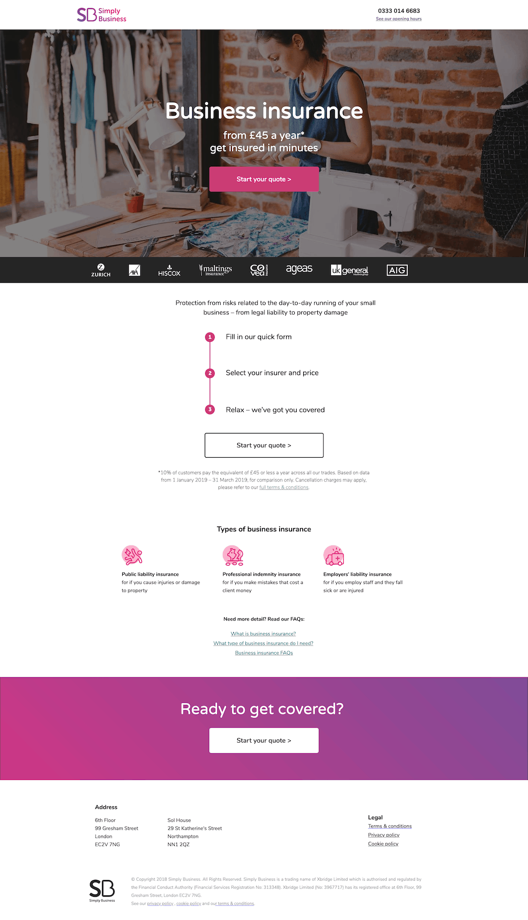
2. Simply Business (industry: insurance)
Instead of bombarding visitors with extensive details about their policies, Simply Business takes a more streamlined approach. Their headline addresses common worries about insurance, such as complexity and cost, providing immediate reassurance. The clear, bulleted how-to instructions make the signup process seem effortless.
Only after visitors click the call to action does Simply Business introduce a multi-step form. By this point, visitors have already surmounted the initial mental hurdle, making them more likely to complete the process.

3. onX
Strong message match increases conversions because it reassures people they’ve come to the right place. For example, when someone clicks on a Google Ad for topographic hunting maps, they expect to be directed to a page that matches their search intent. What works even better is a page that instantly confirms they’ve found what they’re looking for through relevant imagery. A stellar example is the landing page from onX.
Conclusion
Creating high-converting landing pages requires a deep understanding of your audience and a keen eye for detail. By focusing on clear messaging, engaging visuals, and strong CTAs, you can significantly boost your conversion rates.
Ready to optimize your landing pages? At Prism Digital Inc., we specialize in crafting landing pages that not only look great but also deliver results. Contact us today to get started!
.png?width=200&height=73&name=Logo(1).png)


